 Skip to content
Saudi Central Bank
UX Design website analysis

Project Introduction
The Saudi Central Bank (SAMA) is the central bank of the Kingdom of Saudi Arabia. After the name change in 2020, the Saudi Central Bank continued to use the same acronym SAMA. Prior to the establishment of the Saudi Central Bank, the Saudi Hollandi Bank, a branch of the Netherlands Trading Society from 1926 acted as a de facto central bank. It kept the Kingdom’s gold reserves and received oil revenues on behalf of the Saudi Arabian government SAMA is the Central Bank of Saudi Arabia, the functions of the SAMA include issuing the national currency, the Saudi Riyal, supervising commercial banks, managing foreign exchange reserves, promoting price and exchange rate stability, and ensuring the growth and soundness of the financial system, operating a number of cross-bank electronic financial systems such as MADA (previously SPAN), SARIE, and SADAD.
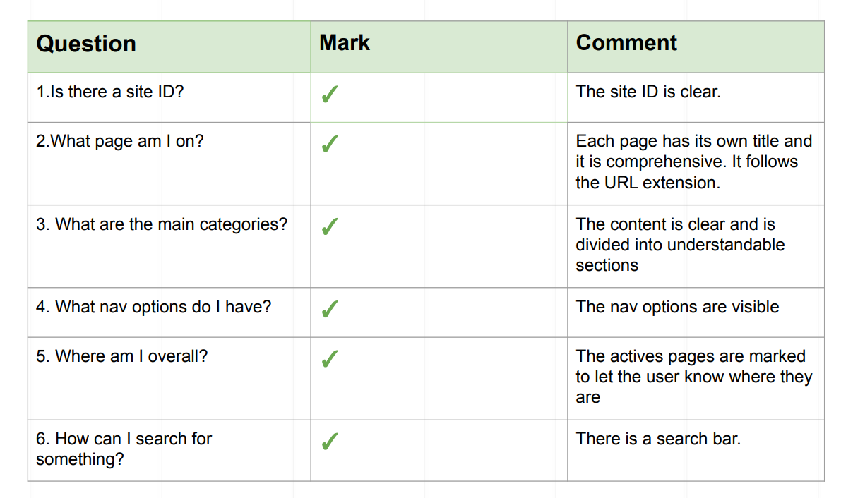
Krug’s Test
Nielsen’s Heuristics
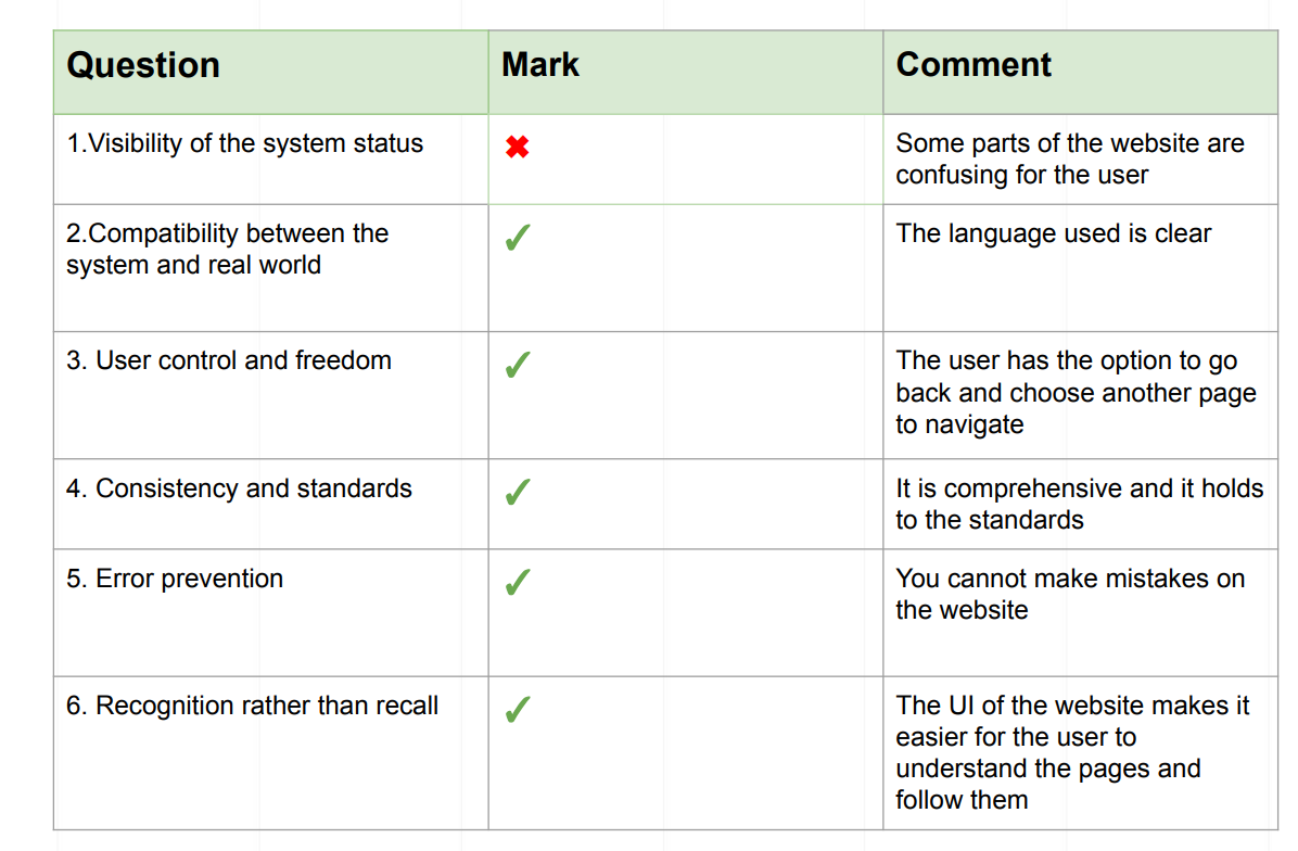
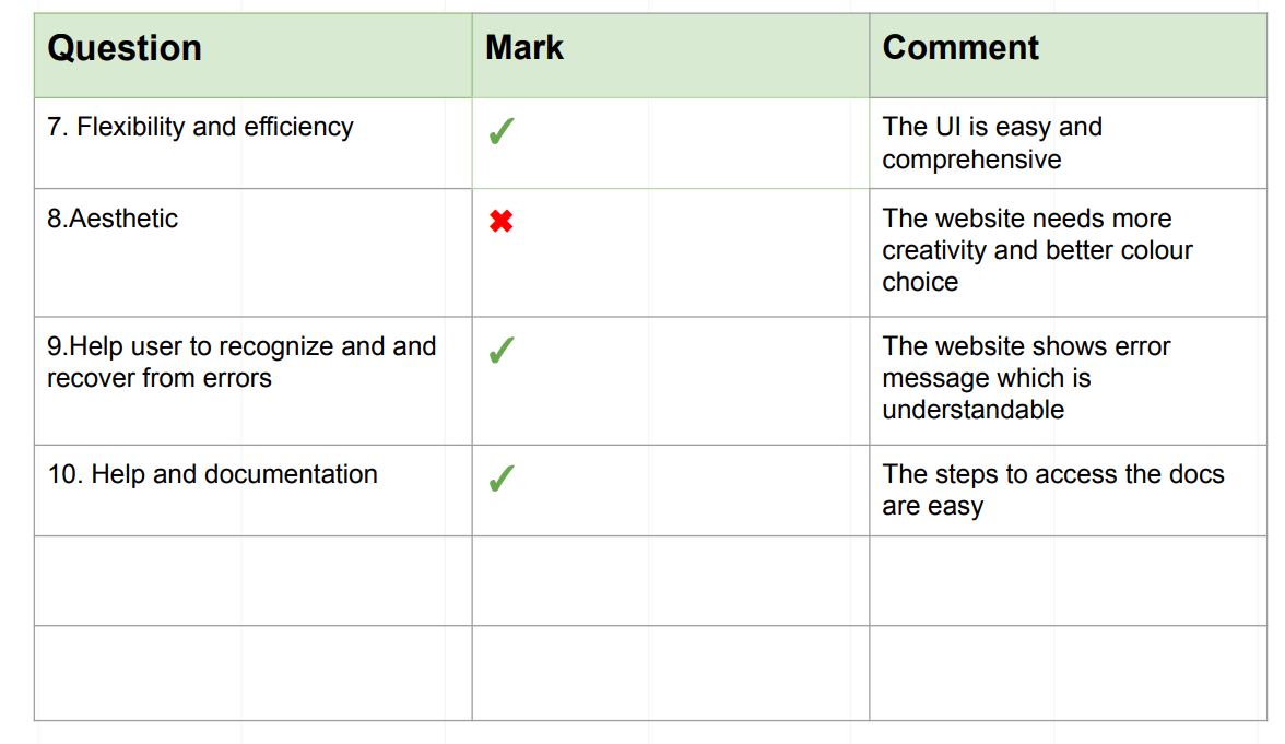
UX Analysis
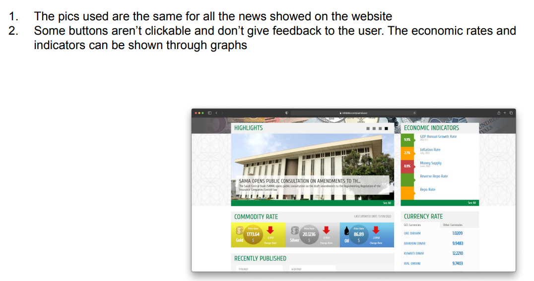
Comments

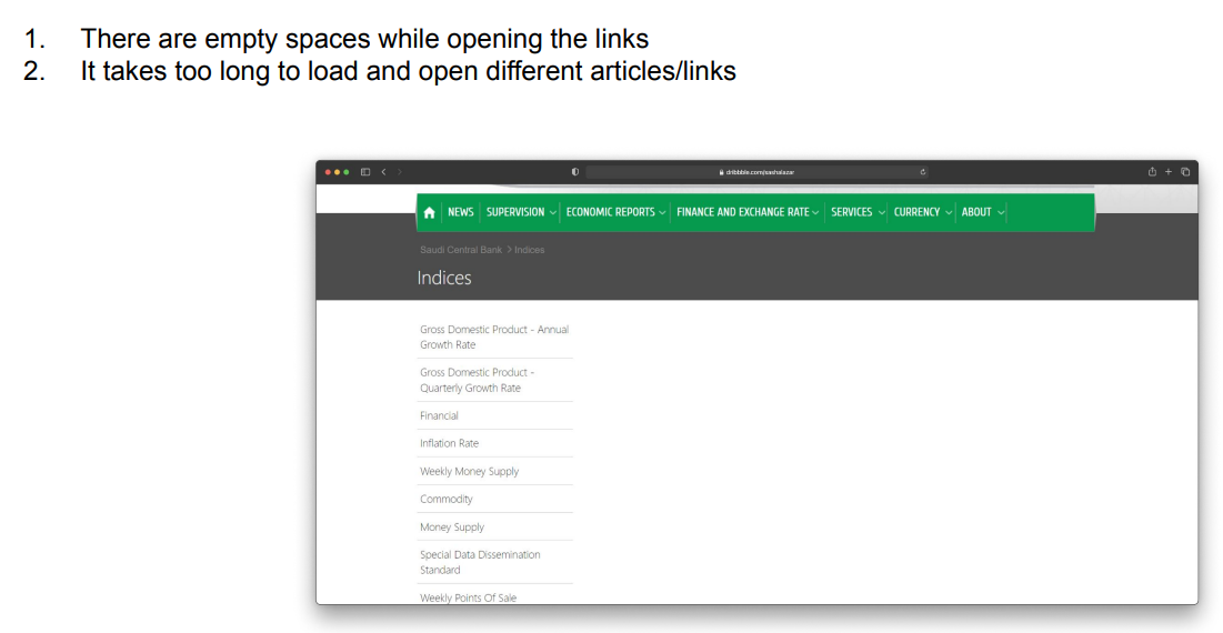
Benchmarking
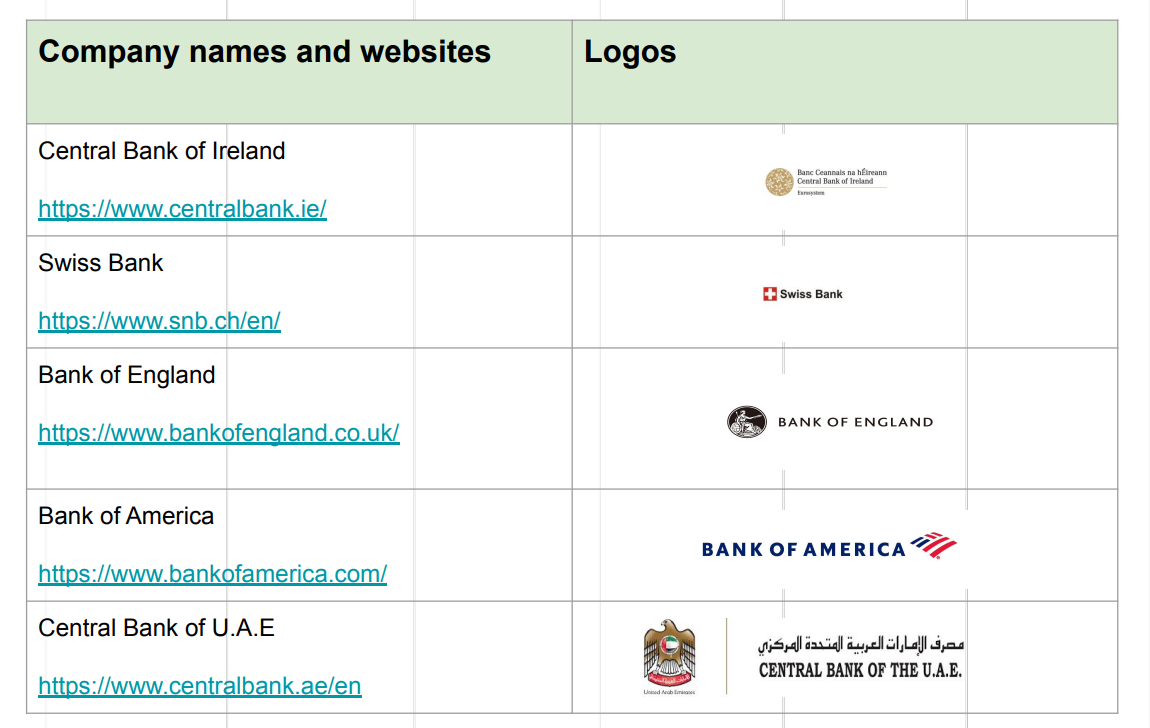
Central Bank of Ireland
Message: Inform customers about the latest updates related to finances
Strategy: Good customer service and very clear and using different channels (social media)

Bank Of England website
Message: Creates an emotional connection with the customers by creating a sense of trust. Caring about their people and financial stability
Strategy: Approaching through customer service, social media and emails

Bank of America website
Message: Introduces you with a variety of payment options
Strategy: Through customer service, website and app

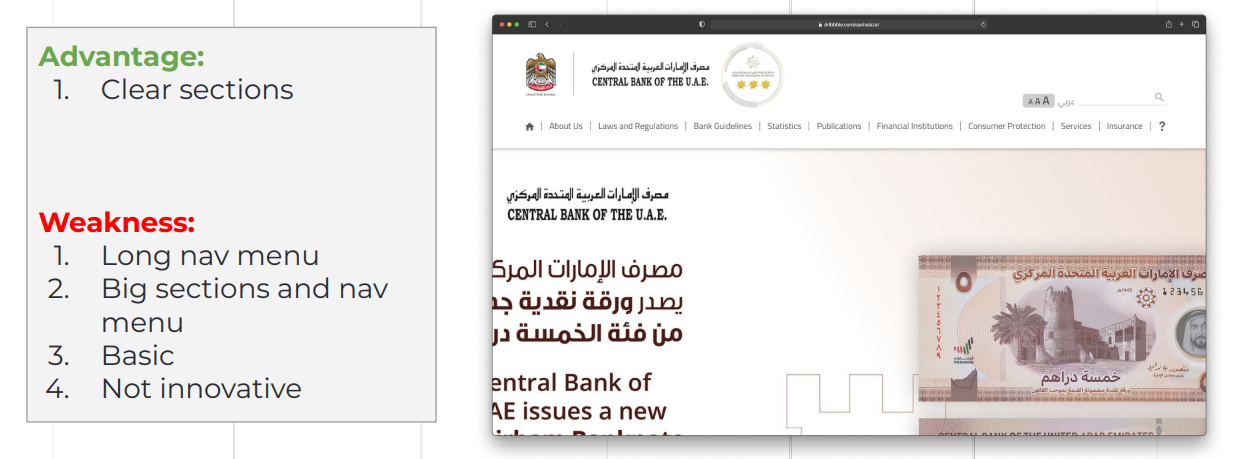
Central Bank of the U.A.E
Message: Giving updates about the latest decisions on the banking sector
Strategy: Through customer service
Overall Insights
Good practices
- Clear value proposition
- Language switching button
- Minimalist design
- Clearer information structure
- Easier navigation
- Accessibility option
What to avoid
- Outdated design patterns and colors
- Blurry images and illustrations
- Confusing and overcrowded text
- Long menu titles
Recommendations
- Book appointment button should be visible and most likely put next to the picture
- Star button needs to be removed
- Shorter menu names need to be put
- A better layout for the website and sections
- Better choice of colors
- Use clear and higher resolution pictures
- Use of more graphs
